Posts

lesson 7

Image
23rd June                               Shot Composition  lo- to understand the basic rules of shot composition  leading lines  Rule of Thirds  Depth of Field  deep focus - flower shallow focus- sheep photographing people  looking room- There should always be a little MORE room on the side the subject is looking toward . head room -dont cut off the top of the head keep in the margin  perspective- the angle of the picture  1. portrait mode, blurring  2. type of shot, blur, effect on the subject compared to the background 3. different type of shot and type of portraits making the main image focused on the subject compared to number 2 

sTEROTYPES

 9th June                   Introduction to media representation  lo- to explore the concept of representation and stereotypes  representation - the media offers the audience an interpretation of the world, it is a RE PRESENATATION of the events, people and places  sterotypical - a stereotype is a generalised representation of a person, place or thing. They are limited and often offensive or used for comedy stereotype expectations  nanny- a elderly woman who loves to knit and very thick glasses  nurse- a woman with scrubs on  teenager- always saying whatever doesn't care lazy moody reckless always think they know best astronaut- man, white, rich  football player- male, musclier, sporty, short tempered, popular, young  opera fan- posh, rich, sooty  teacher- glasses, woman, professional, well dressed tatto lover- cool, interesting  this advert challenges stereotypes with: men can be nurses someone that surfs can be a nurse nurses can do work and still have hobbies like music  mix

in design

Image
 25th May                         InDesign  lo- to explore and understand how to use InDesign for magazine layout 

Magazine Cover Design

Image
 19th May                        Masthead lo- to use adobe illustrator to create and effective magazine masthead  genre of magazine is dream pop  name of the magazine is reload.. they all have common colours as they are all bright and interesting, meaning more people are bound to look at them and have a read, and including a funky image 

Magazines

Image
 5th May                    Magazine Cover Design: Masthead lo- explore the use of Adobe illustrator to create a magazine masthead they are all bright and colourful as it is there to make the eyes pop, meaning all of the fonts chosen are blocky and short. name- dream  12th May do now-

Magazines

Image
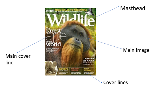
  27th April              Magazine front Covers   lo- to identify the features on a magazine front cover; to explore genre codes & conventions masthead-  the title of a newspaper or magazine at the head of the first or editorial page found at the top of a magazine  dateline-  the time the magazine was published found around the barcode or masthead  main image-  the thing that draws your attention, the thing that involves the story (a football player) found int he middle of the page  cover lines- a line of text on the front cover of a magazine briefly describing the content in the magazine  main cover lines- normally the biggest line on the cover and usually links to the image, the only line that is able to go over the main image  bar code/ price-   how much it is and where the cashier scans it found in the bottom of the magazine  tagline/strapline- the slogan  pull quote-  to draw attention to the article nature genre  there is mainly green colours as that is the colour that r