4th May Coursework
lo- to explore possible tasks and research similar products
Creating a website based on health&fitness for an audience of 14-18 year olds ideas:
- Building your indoor garden
- Outdoor greenhouse
- Benefits of walks outside
- Mental health improved
- How diets can affect our mental well-being
DIY indoor garden
Appeal to teenagers who are bored
Fun
Easy
Cheap
Improved mental well-being
Balanced diet
Weight loss
Using a water bottle cutting it in half, then putting string through it and hang it somewhere to let it grow
Eating healthier- Physical benefits- https://www.nhsinform.scot/healthy-living/food-and-nutrition/eating-well/health-benefits-of-eating-well#:~:text=A%20healthy%20diet%20rich%20in,saturated%20fats%20in%20your%20diet.
- Maintaining a healthy weight and eating a balanced diet that's low in saturated fat and high in fibre found in whole grains can help to reduce your risk of developing type 2 diabetes.
A healthy diet rich in fruits, vegetables, whole grains and low-fat dairy can help to reduce your risk of heart disease by maintaining blood pressure and cholesterol levels.High blood pressure and cholesterol can be a symptom of too much salt and saturated fats in your diet.- Eating a portion of oily fish - such as salmon and trout - each week can also help to lower your risk of developing heart disease. The high levels of omega-3 fatty acids in oily fish are good for heart health.
- A diet rich in calcium keeps your teeth and bones strong and can help to slow bone loss (osteoporosis) associated with getting older.
- Calcium is usually associated with dairy products, but you can also get calcium by eating:sardines, pilchards or tinned salmon (with bones)dark green vegetables - such as kale and broccoli calcium-fortified foods - such as soya products, fruit juices and cereals
- As vitamin D helps your body absorb calcium, make sure you get outside (your body gets vitamin D from the sun) and have plenty of foods containing vitamin D in your diet - such as oily fish and fortified cereals.
Mental benefits-- nutritionists recommend keeping a food journal. Documenting what, where and when you eat is a great way to gain insight into your patterns.
11th May Research
lo- to research codes & conventions of similar products
Create a homepage and one linked web page for a health and fitness website targeted at an audience primarily of 14-18 year-olds
Task 1
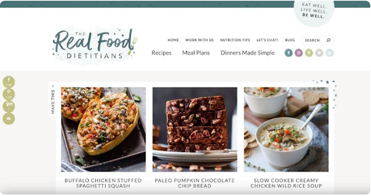
On the home page all of the websites have different sections about health, physical,mental and sexual health
On the homepage there is lots of pictures to catch attention, interactive links there either very plain and basic or there very colourful and eye catching
The colour scheme is very bright and vibrant and includes lots of picture with teenagers in the pictures
The logo is very dark and doesn't draw much attention to itself, but the logo includes what their web page is actually about such as- the dieting website has a title of the real food dieticians another one is about teenagers mental, physical and sexual health and their logo is health for teens which sums up what the website is actually about
The menu bars include things like health, lifestyle, feelings, nutrition tips, advice
The other links on their home page are things like different meals to have, exam stress, teenage sleep, teenage depression
Different fonts are changed throughout the home page, their usually smaller when you look at the menu bar, but then get bigger when you see the articles and how they can help with what they have got to offer. But some of the fonts are the same just blocker to be more bold in your face, and some are slimmer and less noticeable to not distract you from the main point of the webpage
The linked pages are laided out in boxes not far from each other, they are also very random but all fit in the page, like an organised mess
Theres an image on every linked page to add some context to the article
The linked pages are using the same font but just smaller inside the actual boxes
In the text pages there almost a pull 'quote' to interest you into reading the article
For your chosen brief, find two similar examples of each of your products
Screenshot shot/add link and
- Explain what the purpose of the product is
- Explain who the target audience is in detail
The purpose of this website is for teenagers and to help with their physical, mental and sexual health.
The target audience for this website is teenagers we know this because there is a section about exam preparation/stress. we also see about sexual health and not many websites have this but its important for teenagers to know about sexual health as they need to be able to look after themselves safely and its useful to have information about this. we see how theres a lot about emotion health which is very important for teenagers as ours brains are still developing and many feeling arise throughout and not everyone has a safe space to talk about this. But this website has given a lot of teenagers a place to go to if they feel unsafe or unsure about what they are feeling about, but with this in place there able to know where they can get support and help, this then appeals to the target audience as there
The purpose of this website is for people to be able to get healthy meals from dieticians without having to actually go to the dieticians
This doesn't fit the target audience, but some teenagers may look onto it if they fancy a career in cooking as it involves lots recipes which are healthy and tasty which means that it improves your physical health, and cooking does help some people mental health
18th May Research
Codes and conventions are seen in the use of their graphics as they are very bright and colourful. the pictures are shown to be informative as they symbolise the target audience, and cartoon pictures to be easily recognised. We also see how they have used a teacher and student which is very recognisable as it shows the target audience is teenagers, which many teenagers can relate to this. The text they have used is very bold but short snaps of information, it gives the reader something to see and grip their attention instead of reading masses of text.
The homepage is very bright and informative with plenty of pictures and there linked pages are just as similar it includes many pictures, lots of information and the same colours. They also have there logo on display on all of there linked pages making sure the company is being recognised. They keep the same colours on the home page and linked p[ages flowing with the theme
This website includes feelings, growing up, health, lifestyle, relationships and sexual; health. This links to the target audience because it is helpful for teenagers, as they need to know and have information about these kinds of things, they mainly promote good mental and physical health for teenagers
The logo is plain and basic, easy to read and recognise the slogan is very simple and basic its what you're here for health, and the the colour scheme is very bright and only 3 solid bright vivide colours
They use very solid and bright colours to grasp the audiences attention, the typography the font is very big and bold and the colour is just black
the target audience is for teenagers it appeals for them as it shows them information about themselves and where to find support if they cannot access that at home
The images shown are with teenagers which can be easily recognised and they are usually people or cartoon characters
theres no videos
The codes and conventions used show how the website is very plain and doesn't reach the target audience due to the age gap between these ages. The font they have sued is very grown up in a sense as its curly and many people with websites aimed at adults use these kind of fonts to make their website look cute and elegant
the homepage is very simple and gives you a look into what their website is about, but the linked pages show how the different recipes and health benefits these food give you, there similar in the font style and in the elegance theme
It doesn't link to this target audience
The logo again very elegant and formal unlike the target audience website and their colour scheme is very bland and white
The colour palette is very basic and plain, its very basic which is the same with the font because its not for teenagers it doesn't ft the target audiences needs
It doesn't appeal to the target audience as its not aimed at them
The images show pictures of their recipes and their food
There are videos of their food being cooked and how to help with that but agin it doesn't meet the target audience
8th June Coursework Planning
lo- To plan an effective product aimed at a specific audience using appropriate codes and conventions
Codes & Conventions
- Style- very minimalist and an organised cluster
- Typography- very big blocky fonts
- Image- involving school
- logo design- very bold and easy to see and read
- Content- appealing towards the targeted audience
- Colour palette- plain colours, lots of blue
- Linked pages- very informed and easy to get to
Website Planning
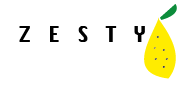
Name ideas- keep it zesty, fitness for you, zesty
The website aim is for young people (16-18) being able to cook quick and nutritious snacks that would be easy to make and be very few ingredients, but also including things in the fitness side of things. What are he best workouts for teenagers and the benefits of playing sports for the teenage body
The style will be cluttered but also organised, I'm trying to make it interactive so theres lots to read on the website but its all organised but theres going to be lots to read and look at with lots of pictures as the target audience seem to like pictures on websites as theres more things to look at
Logo ideas-a lemon
Slogan ideas- heal the world with health
Image ideas- pictures of food, pictures of all body types
SM platforms to include- Instagram, Tik Tok- very trendy apps that many teenagers have access to or already have accounts. This makes it more interesting to the target audience because it enables them to see things they would want to see and maybe have seen before, again creating an acknowledgement of the target audience
Things to include in the homepage- navigation bar, links, pictures, text, video, logo, slogan, menu
Video ideas- making a meal, how to grow your own herbs, an exercise thats quick and effective, how to play a certain sport (tennis, rounders)
Linked website- being about the nutritious part of the health side, including snacks for teenagers which would be easy to make and healthy for a teenager ' count the memories not the calories'
Design logo-

22nd June Adobe Illustrator
LO- explore the use of Adobe illustrator to create a magazine masthead or logo
29th June Target Audience
lo- to research our target audience to enable successful targeting
Target audience- profile
My target audience thinks school as a chore and not an enjoyable thing to go to, its hard for teenagers to be getting up early in the morning and because our brains aren't fully developed yet we still go out to school and have to be engaging for 6 hours. My age range is 15-18, my gender is mainly aimed at girls. Hobbies are mainly aimed at people who like to cook/bake, more likely to live in both urban and rural as i'm going to try to make it exclusive to everyone to make sure people can find out how too cook or bake some easy meals without taking up lots of time and ingredients. Favourite subject would help if they liked cooking, and how they use social media would be an impact as you can find easy recipes on tik tok and instagram but they might not want to use the media much thats why i am making a website to help with cooking and fitness.
Name: zesty
Website aim: to get teenagers to make their own snacks with limited steps and give fitness advice towards teenagers
Style: above
Logo ideas:

Slogan ideas: fitness for you
SM platforms: Instagram, TikTok
Info to include: menu, task bar, logo, navigation, headlines, photos, footer
Representation: they will be represented as teenagers and be relatable not perfect body types and what foods are healthy and unhealthy
Video ideas: making your own vegetable or herbs, an at home workout
How will it appeal to your target audience: because it will be bright and colourful but not too busy or organised, it will also involve person details that directly link to teenagers, and will will be interactive
14th September Coursework Review
lo- to recap brief criteria and to explore how to create effective representations
How is your homepage going to follow the layout/content convections of a homepage?My homepage is going to have multiple images on the homepage, i am going to have the logo and name on the side of the page with a navigation bar with one linked page.
How is your linked page going to follow convection and what is your video going to be showing?
I am going to have a linked page that talks about eating healthy and quickly, a way for teenagers to easily make a quick snack after school, during studies, or even for a quick boost. The text will be reinforced with photos of snacks and how quickly and easily it is to make small snacks, i will also have different categories of snacks. So I will have snacks perfect for studying as fruit helps with studying, what to eat when you are doing weight training or cardio, and I will also have a section for snacks to make when you just need a pick me up. These will all be quick snacks and snacks that include staple ingredients.
navigation bar ideas- no equipment exercises, mental health
To Do:
- original written text
- planned video
- planned photos
- unoriginal images
- research recipes and snacks to make
28th September
Do Now-
5 section headers for my website
- Fitness For Teenagers
- Diet
- Mental health
- At Home Workouts
- Breathing Exercises
2nd November Article Writing
lo- to create a convincing article for teens health & fitness website using appropriate language, tone and representation
Do Now
Different types of articles
- interview
- recipe
- workout scheme
- dieting plan
- health tips
- reviews of clothing and gyms
- fact file sheet
- how to ..
- problem page
- profile
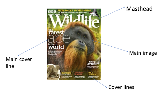
Key elements on double page spread:
- Heading- title
- Pictures
- Text
- Sub-headings
- Linked websites for more information
- Stand first
- Columns/Text boxes
- Pull Quote
Thinking Points-
- My homepage links to my linked page as they both have the ideas of fitness in them and include the key factors of health and fitness
- My article is about healthy snack ideas for teenagers as many teenagers don't have time in the morning or don't have the money to go and buy something for breakfast before school, but with this linked page it will show them different recipe ideas to help keep them energised for different occasions
- My images are going to be of different types of snack and quick ways that people can exercise such as a picture of trainers and weights as this enables people to exercise where ever you are. They are going to be informal images
- I will have different fonts on the homepage and linked page
- Sub heading for the website will be snack recipes


RESEARCH:
ReplyDeleteExcellent detailed research & anaylsis - well done
TA PROFILE:
A thorough profile
PLANNING:
A good start - love the logo - but make sure it connotes H&F and not just food.
Great ideas